


design influence & world tour
Before getting into it here’s our event calendar for this week
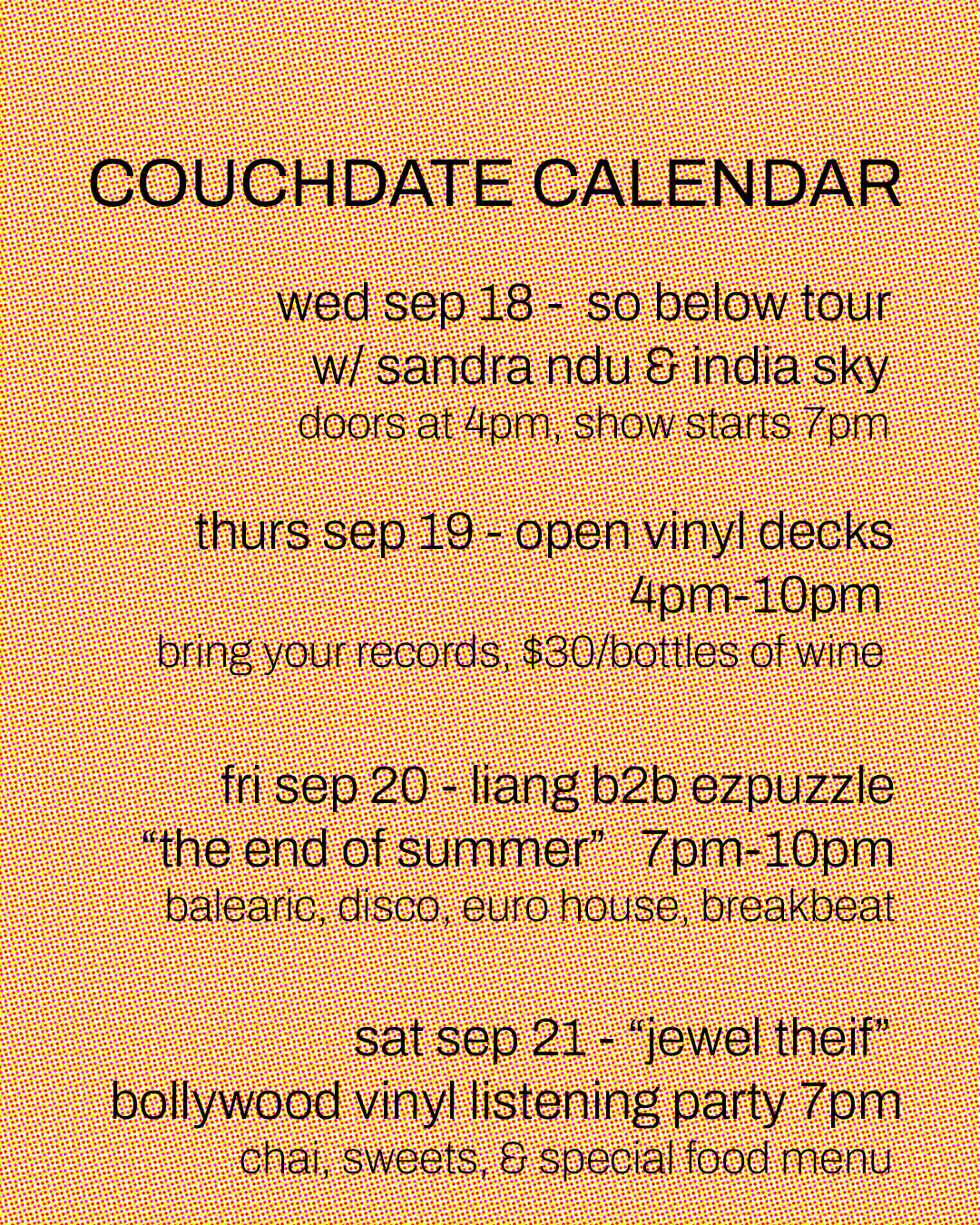
Intimate show on Wednesday, Open Decks Thursday, my favorite DJ on Friday, and a special Bollywood Vinyl Listening Party on Saturday. I’m gonna be cooking for the listening party on Saturday, super excited about that.
Also this week, couchdate starts it’s world tour!
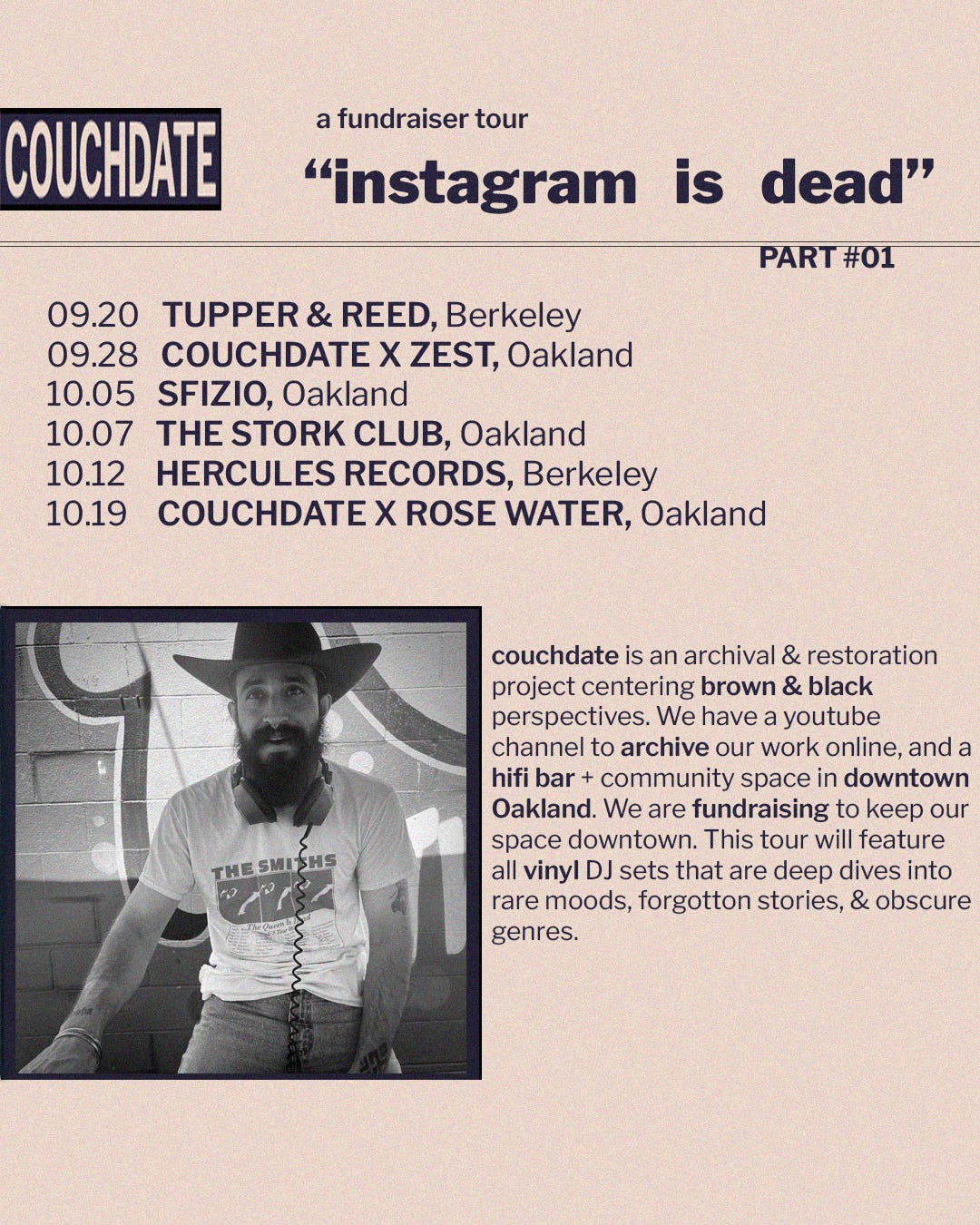
And by world tour, I mean Bay Area tour. And by Bay Area Tour I really mean East Bay Tour. And really it’s mostly an Oakland Tour. I mean that’s where all our favorite places are.
A lot of my friends own or run these spots. couchdate has always been about the community, and it feels so right to be bringing our magic and combining it with the magic of these small local businesses. This first stop is at the historic cocktail bar Tupper & Reed in Berkeley. Initially designed as a music store in 1925 by architect William Yelland, the space has been a concert venue, community space and most recently the cocktail bar Tupper & Reed. T&R have sponsored monthly residencies for local artists since the beginning.
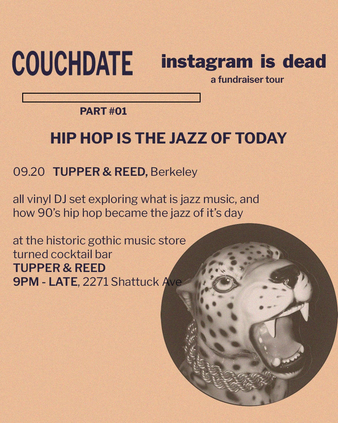
My set there will be an exploration of ingenuity, culture, and how hip hop is the new jazz. So much of my record collection falls under these two categories. Just the thought of sharing their connection with ya’ll brings my heart a little leap of joy.
Design
couchdate is all about to design. From the flow of a space, to the furniture & fixings inside, to the materials used to promote the space. The propaganda. Just like with interior design, I have zero formal training in graphic design. Much of what I make is informed by my sensibilities around utility, open space, and the typesetting of the records I collect.
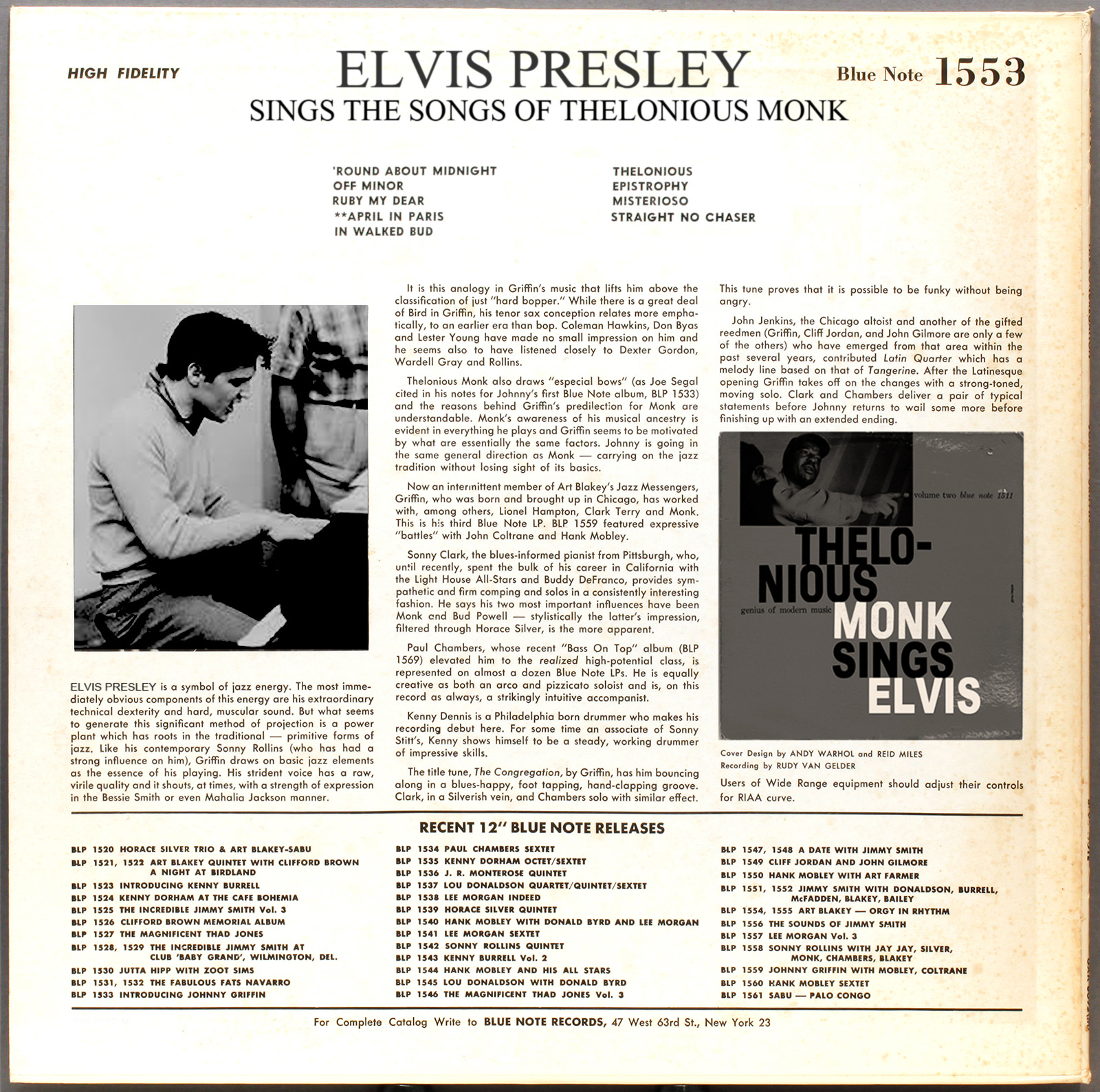
One of the most important aspects of any graphic design is legibility. The ability to clearly read and understand the information being presented. Some of the most iconic, and thus unsurprisingly legible examples of this on records in Blue Note Records.
For my tour flyers I had a lot of information I needed to convey on a flyer that fits Instagram formatting, so I turned to my Blue Note albums. So many words, but so easy to read and they always looked cool. With a little digging I found the type used most commonly was Franklin Gothic. However, Franklin Gothic was initially conceived as a single weight font, and a variety of weights is crucial for defining different sections.
So I settled on its closest relative Libre Franklin which worked superbly. Everything from extra light to extra bold was available.
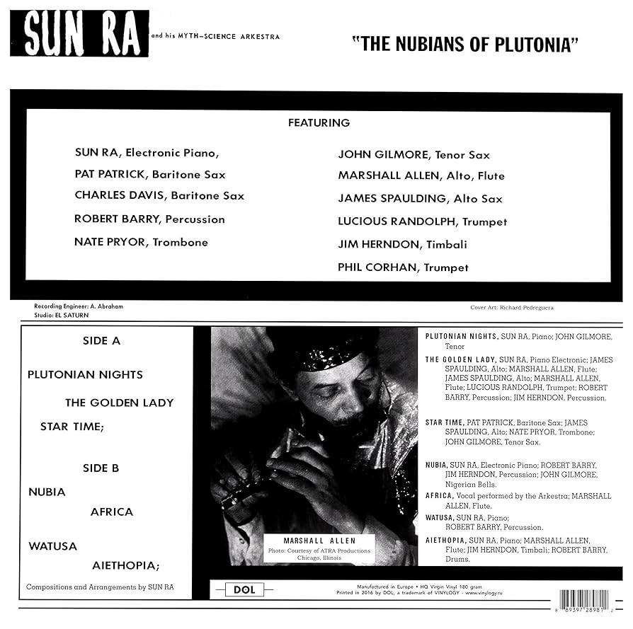
I also referred to the book Sun Ra - "Art on Saturn" for distinctive art outside of my collection. Early Sun Ra records released on Saturn Records heavily riffed on the Blue Note covers, if not outright stealing from them.
It’s incredible how much you can do with one font in a bunch of several weights and sizes. I really believe that simple, utility informed design will always lead to style. I’m so happy with how the flyers came out, and how they reference a lot of the culture couchdate is built on. See ya’ll on the world tour!
Love,
Emmanuel